Flourish is a mobile application that aims to empower people through education, knowledge and advocacy - equipped with an intuitive menstrual cycle tracking system that enables people to take charge of their bodies.
This app was created as part of the Adobe x MTV College Creative Jam, centered around encouraging advocacy. My teammate and I wanted to break the stigma around the menstrual cycle and create a tight-knit community for those on their periods to relate to each other, share stories, and find comfort. This led us to the idea of encouraging the everyday user to advocate for a cause, through platforms that they already use.
The Design Process
adapted to fit our design sprint
1 PROBLEM DISCOVERY:brainstorming + concept mapping, problem statement
2 IDEATION:user personas, competitive analysis, information architecture
5 REFLECTION:key takeaways, what I would change next time
DURATION 4 days November 11-14, 2020
TEAM Vanessa Szymanski Brittney Cheng
TOOLS Adobe XD
ROLE Product Designer
During the Adobe x MTV Creative Jam opening ceremony, they revealed the challenge: design a mobile app that encourages individuals to advocate for a cause through the use of pop culture & media. We were able to choose any cause we liked, so we began discussing different causes and researching the ones we felt strongly about.
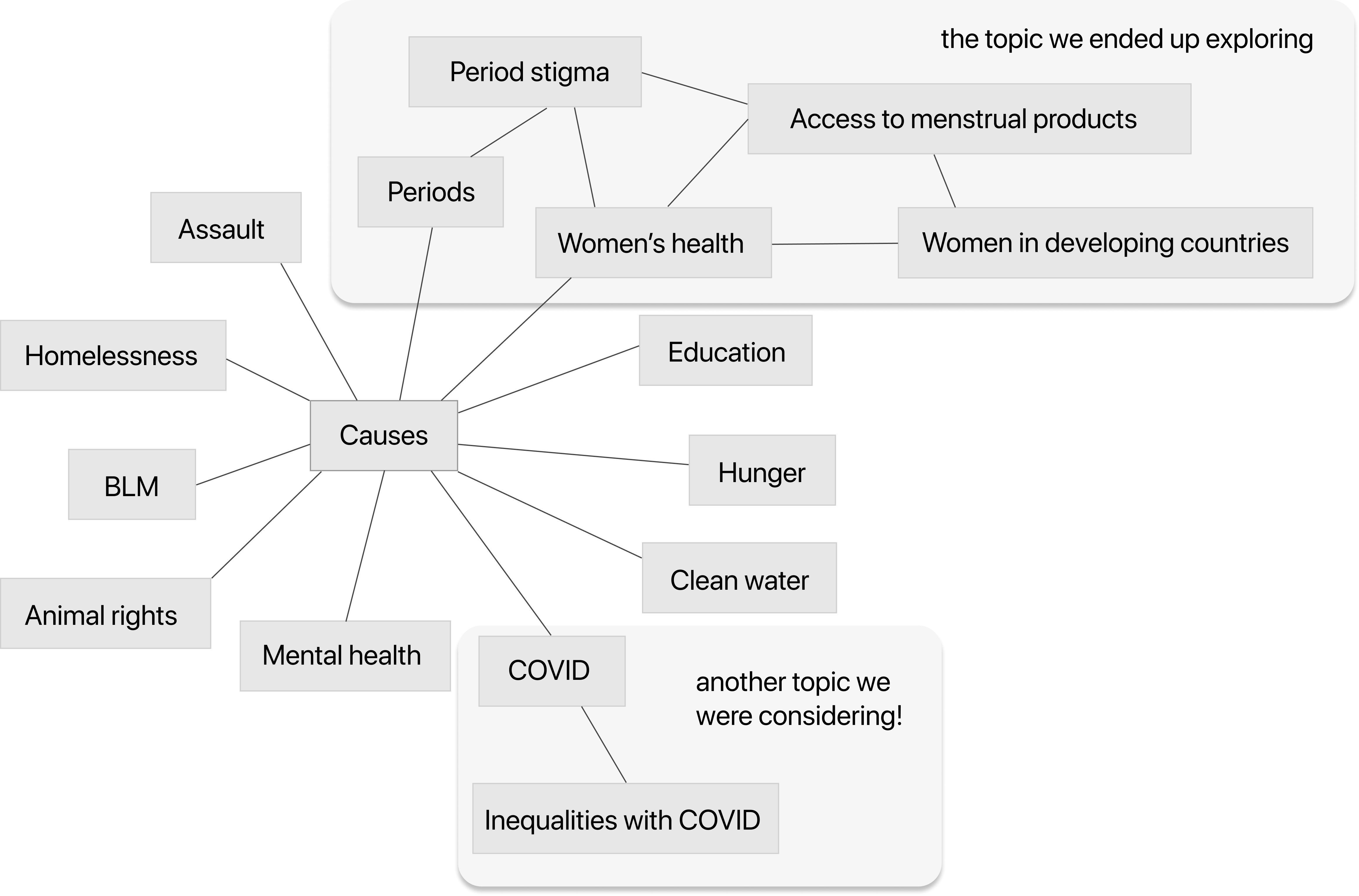
BRAINSTORMING & CONCEPT MAPPING
We began with a simple concept mapping activity on Adobe XD and aimed to write down any cause that came to our minds, no matter how random or unfeasible it seemed to us.
PROBLEM STATEMENT
Given the initial prompt, “How can we encourage advocacy through pop culture or media?” and our brainstorming session, we came up with a more specific problem statement to fit our app.
“How can we encourage casual users to advocate for period poverty while providing valuable functionality through a mobile application?”
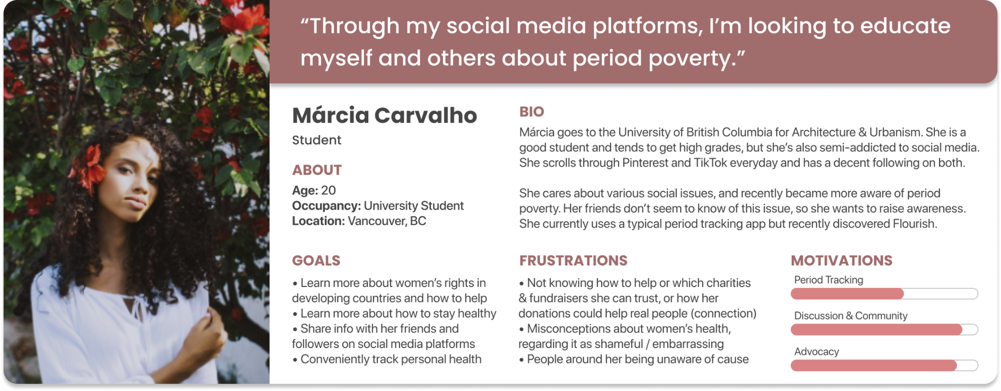
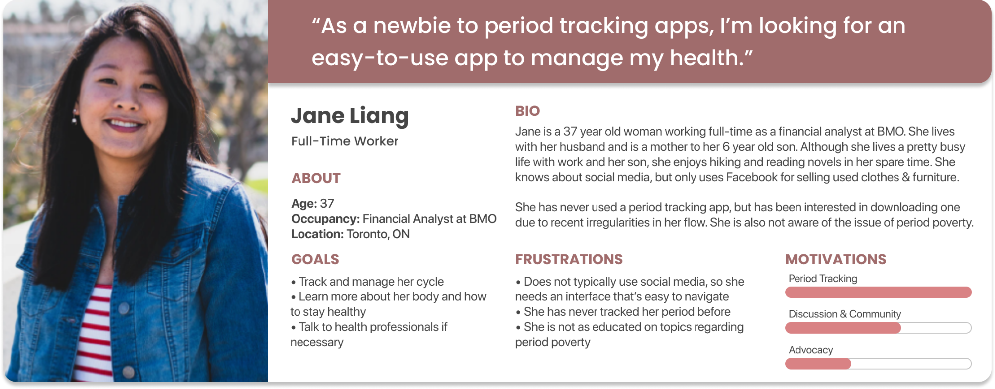
USER PERSONAS
In order to empathize with our target user groups, we created user personas about a variety of people who may use our app, varying in age from pre-teens to adults.
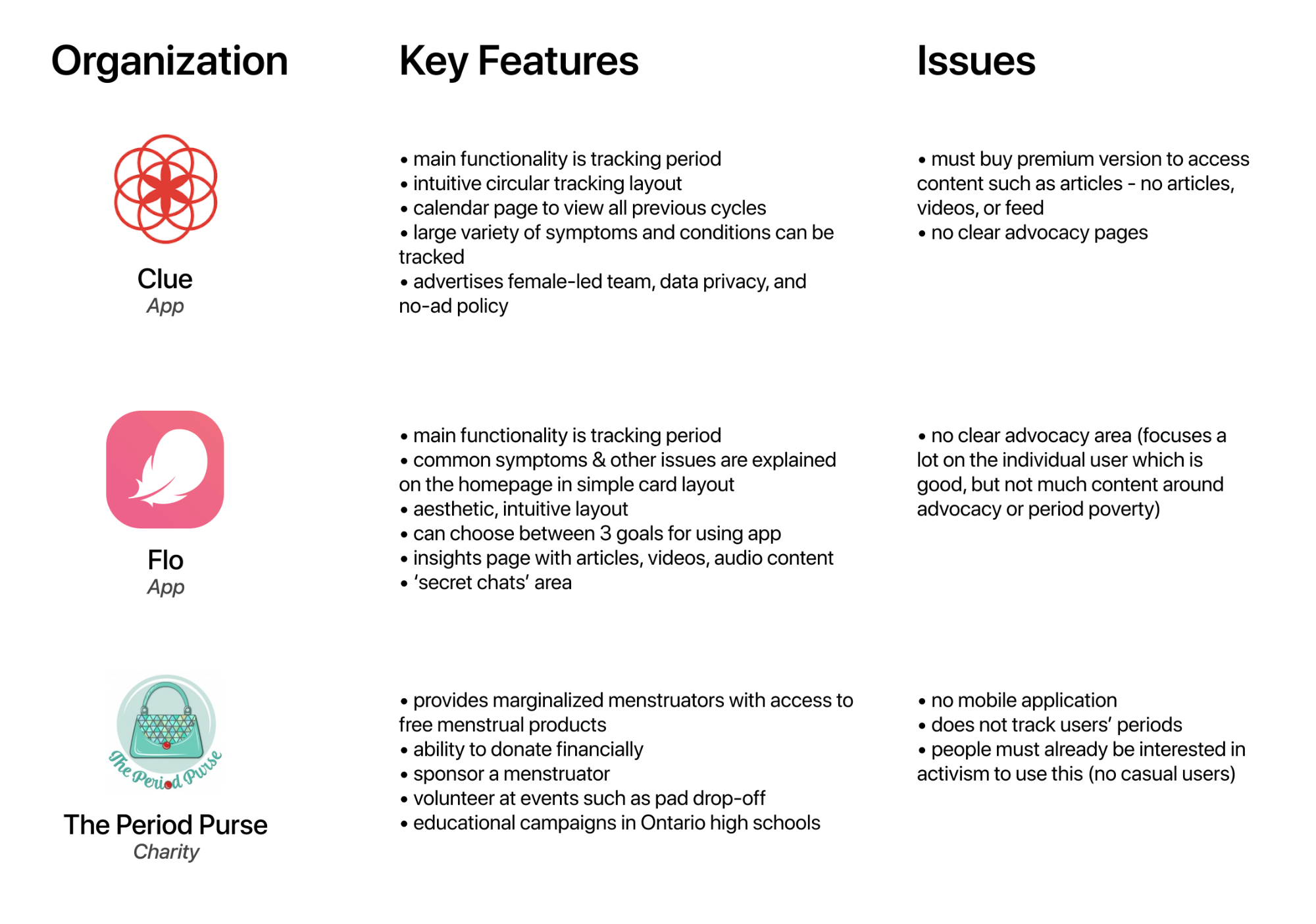
COMPETITIVE ANALYSIS
We looked at other organizations who are working in the same problem space, to gain inspiration and see what improvements we could make to existing products.
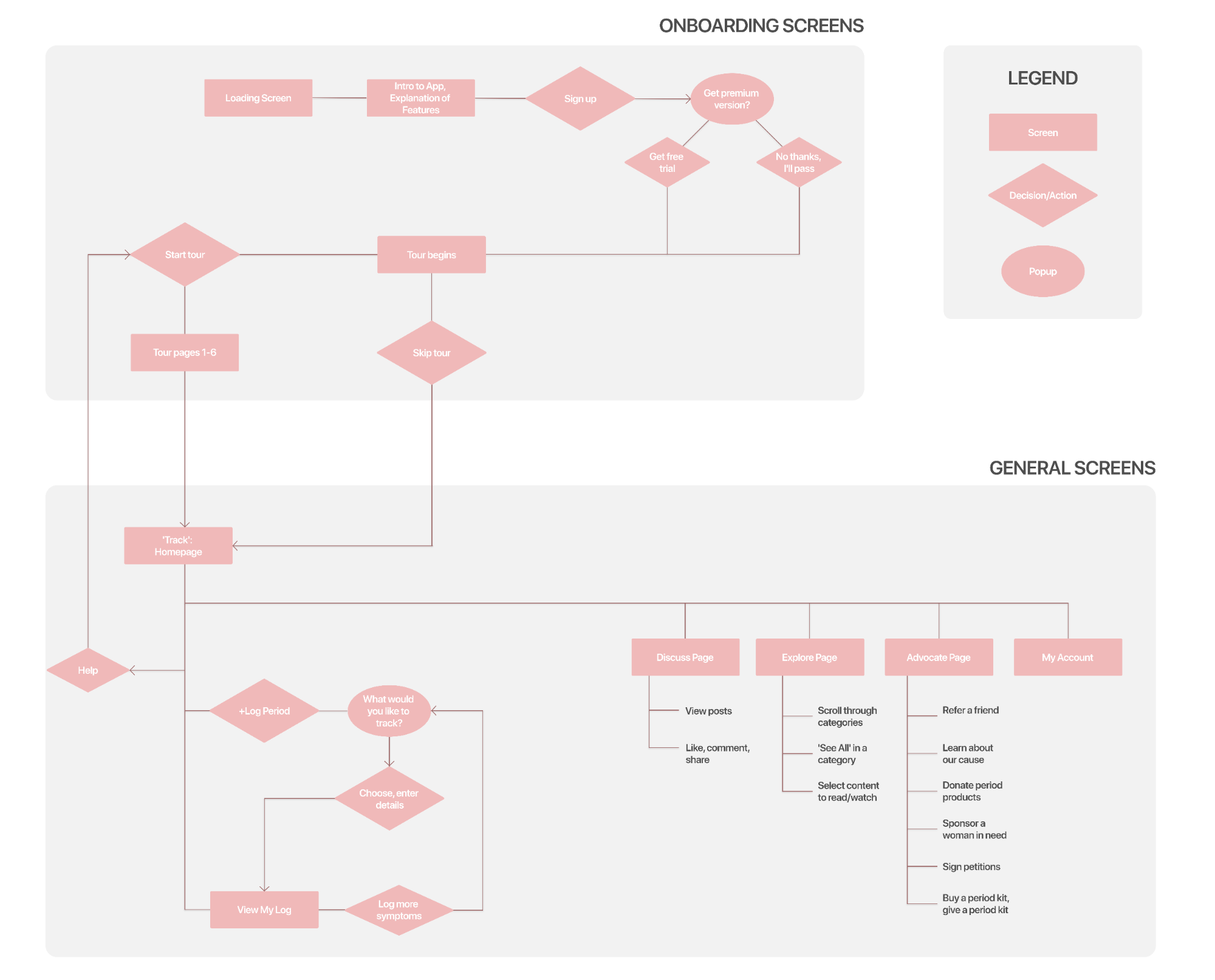
INFORMATION ARCHITECTURE
We discussed features that we thought would be beneficial to users through a quick ‘feature jamming’ meeting. Then, we talked through what the user flow would look like, creating an information architecture flowchart in the process.
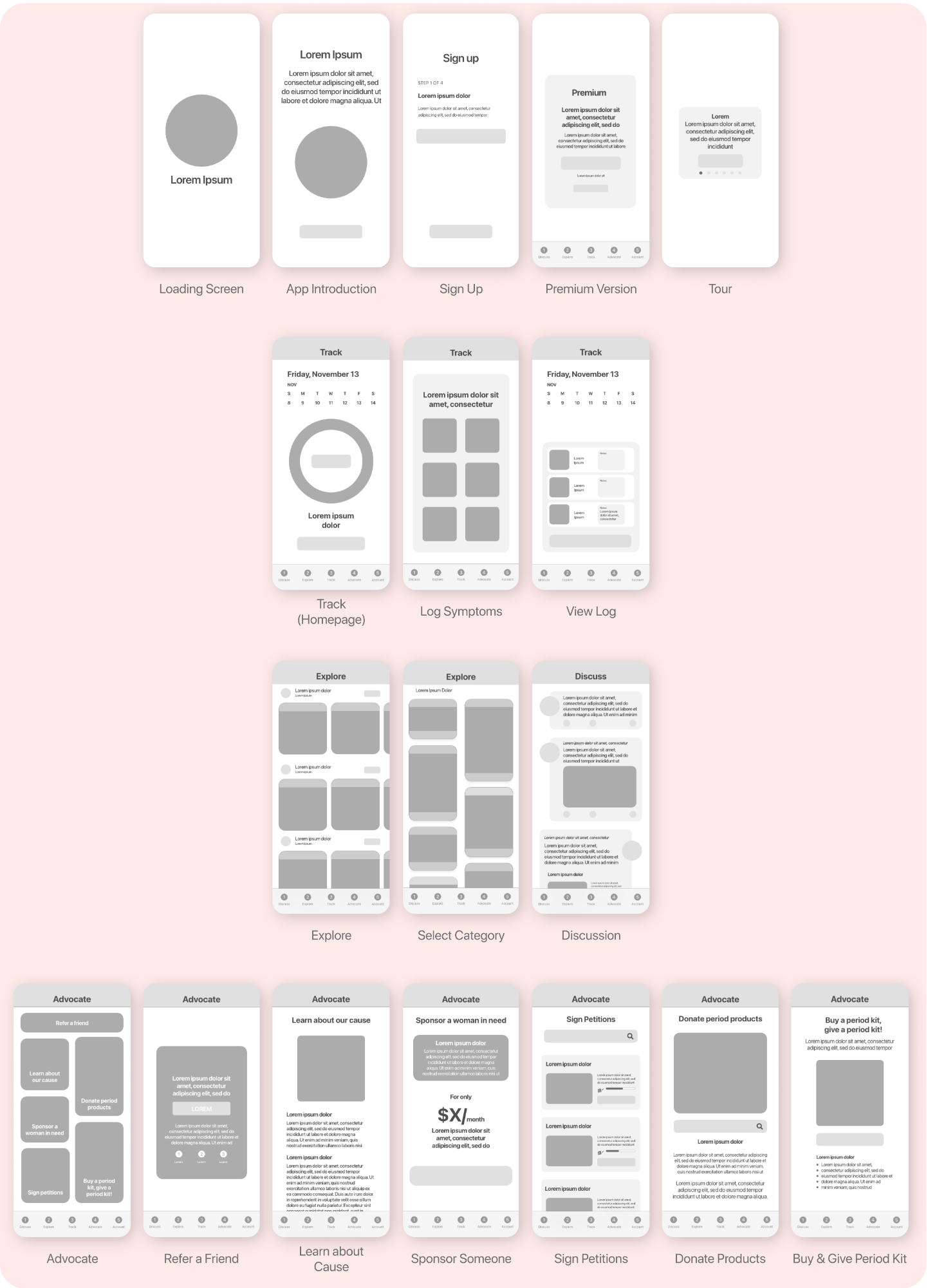
WIREFRAMING
After finalizing our information architecture above, we moved on to low / medium fidelity prototyping of the app’s main experiences - onboarding, track, explore, discuss, and advocate.
VISUAL DESIGN
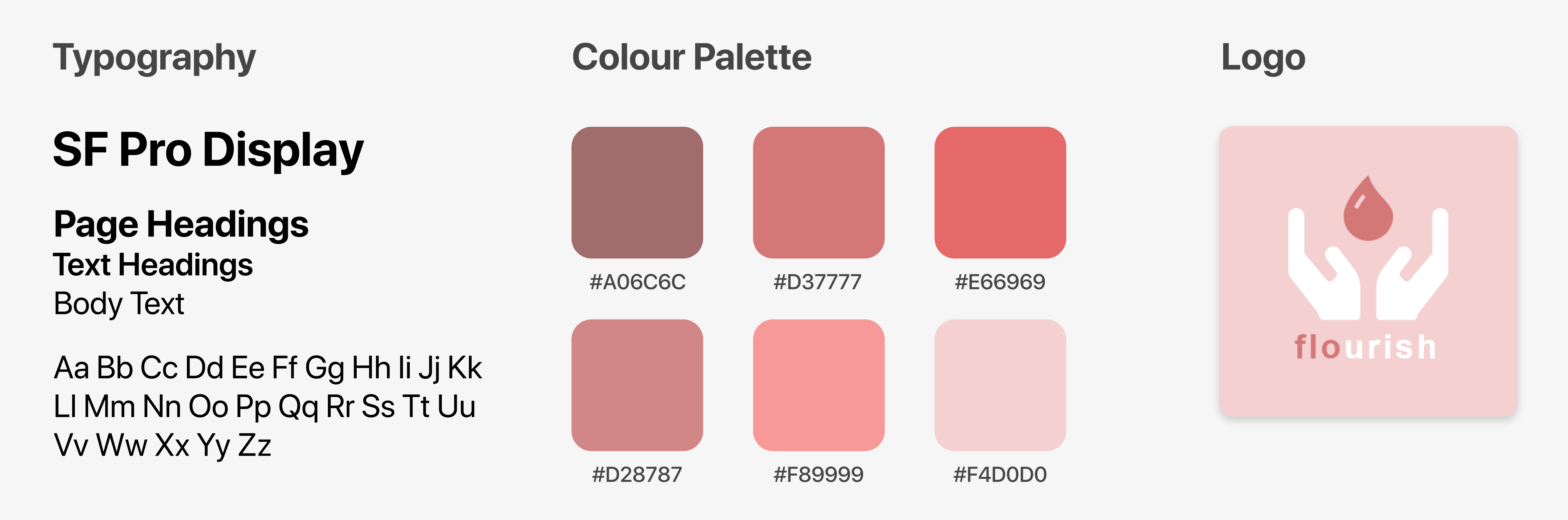
We created a style guide for our app to establish strong branding. We opted for the name ‘Flourish’, which is a wordplay that combines the ‘flow’ of a period with our app’s mission - for our cause to flourish. The colour palette consists of reds and pinks to represent the intersection of femininity and strength.
INTRODUCING THE FLOURISH MOBILE EXPERIENCE
Onboarding
Step 1
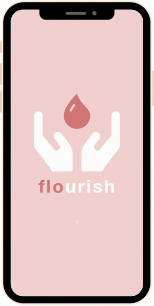
The app opens with a loading screen and some animations. Here, we introduce the app's branding and mission, followed by a simple sign-up process.
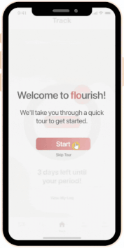
Tour
Step 2
After signing up, the app starts with an optional tour to show users around the app and introduce them to the main screens. This is especially important for showing users all of the community & advocacy features embedded within our app - there's a lot more functionality than just tracking the menstrual cycle!
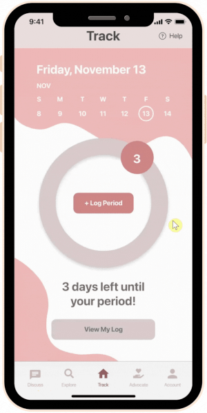
Track
Step 3
This is the portion of our app that we expect the majority of our users downloaded the app for. Having a way to track one's menstrual cycle is crucial, so we aimed to provide this feature with an intuitive, aesthetic interface. Users can track a variety of symptoms with specific details about each type; then, this data can be viewed in a daily log.
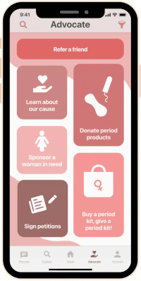
Advocate
Step 4
This is probably the most important section of our app - advocating for our cause. We implemented this feature in a way that is easily discoverable but not forceful in its display, as we wanted our users to learn about the cause and help out on their own terms, however they are able to given their personal situations. In fact, that is the bottom line of our app - we aim to encourage advocacy in the everyday person's life.
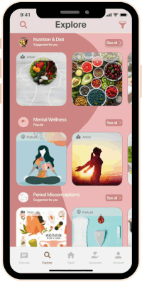
Explore
Step 5
Taking inspiration from many popular social media apps, we decided to implement an Explore page to allow users to read up on issues that concern them, regarding any aspect of their lifestyle. We decided to sort the content by categories, so that users can scroll through a curated feed of posts related to the topic of their choice.
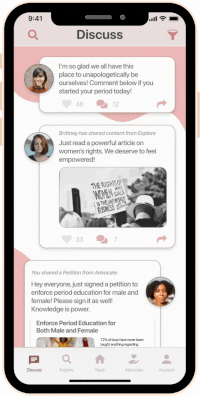
Discuss
Step 6
Finally, we created a Discussion page for users to connect by sharing funny stories, relating over common problems, or finding other people who are going through the same thing as them. Menstruating can be an isolating or even scary experience if you do not have anyone in your life to talk to about it, so we wanted to create a safe space for our users.
KEY TAKEAWAYS
Firstly, I learned that I always need to think about the type of language I’m using and the implications that go with it. Inclusivity in design is so essential; I don’t want to leave out a group of users or give them negative feelings from using my product. (More on this in the next section.)
I also found the research & ideation for this project to be quite interesting. My teammate and I realized how difficult it is to design an app that not only allows users to advocate for a cause, but also fulfills some sort of basic need or functionality in our users’ lives. The mission we took on was to inspire advocacy in an everyday user; it is simpler to design an app that just prompts users to sign petitions, fundraise or spread awareness, but we wanted to go beyond that. We realized it is challenging to motivate people to download an app or advocate for a cause that does not directly affect them. Therefore, it is important to always consider user intentions and motivations to ensure your product will reach a greater audience.
In addition, here are some realizations I had regarding the design process: • Setting a schedule for each step of the process can be helpful with keeping on track. • Timed activities prevent you from getting caught up in the details, which is especially important in a design sprint like this one.
WHAT I WOULD CHANGE NEXT TIME
If I were to create this app again, I would address trans and gender non-conforming users by taking away the implication that only women have their periods. Language is important, as I mentioned above, and I seek to include all users, not exclude.
In addition, conducting more in-depth user research could have been beneficial and allowed us to better understand our user group. Even a quick survey would have helped to challenge our own assumptions and ensure that we were designing for a larger group of people than just ourselves. While our user personas helped us to empathize with our imaginary user group, the best practice would have been to survey and/or interview people first, then create our personas based off the data we received.
.png?h=f867b314adfe94d01a715ac445c13354)